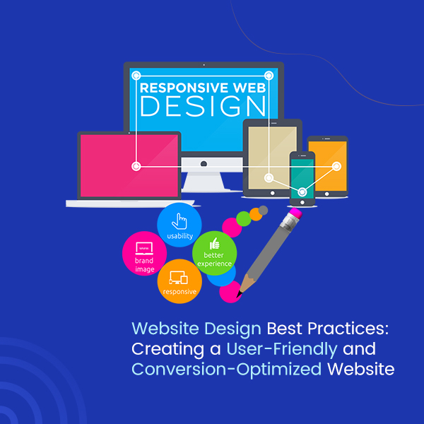
Table of Contents
Introduction
Nowadays, if an organization doesn’t have its own website, it is almost like they don’t exist in the market. A website acts as a digital presence in the present world where everyone increasingly operates online; it allows businesses to provide important and helpful information about their products and services while connecting with potential customers. Websites are widely utilized for lead generation and increase conversions, which helps in overall business success. All websites are not designed similarly.
Whether it is related to fashion or technology, the trends keep on changing. As there are changes in technology, our tastes and preferences also keep on changing. This concept is valid for web designing also. Thus, it is very important to stay a step ahead when it comes to matching the latest web design trends. We have shared certain best practices for a well-designed website and to increase a webpage’s user-friendliness. So we will talk about what are the best practices in web design which will result in a higher conversion rate for your business in this varying preference of people.
Reasons Why Conversion-Focused Website Design Is Important
1. Increases Reliability of Your Business
A conversion-optimized web design allows your visitors to make an effort to complete their needs, such as form submission, email signup, requesting a quote, or purchasing a product. This inculcates assurance in your targeted audience and develops trust among users, which results in converting them into customers and turning them into a supporter of your brand.
2. Simpler for Users to Understand
When visitors are familiar with a layout it becomes easy for them to search what they are looking for. If you are placing everything in different corners of your website, it will take longer to search for what they want. There are more chances that customers leave your site; thus, the design of your website matters. Moreover, when creating or updating your website, it is very important to think about what every element is designed to do.
3. Supports You in Competition
A conversion-focused website design keeps you a step ahead of your competitors by delivering a greater user experience. Conversion optimization is key to sustaining the competition while maintaining the reputation you have created and continue to be at the top in your respective domain.
4. Increased Return on Investment
You put a lot of money at stake when you drive traffic to your website through paid ads. When your website is optimized according to conversion focus, the probability of paid traffic being converted into customers becomes high. This ensures that you get more sales; as a result, you get a higher return on investment from paid campaigns.
Best Practices for Designing a User-Friendly and Conversion-Optimized Website
1. Choose a color scheme that suits your brand
The selection of the color scheme is the most important factor for your website design than you can think. Users judge your website in less than a minute. Many times, it depends on the colors you choose. Color can affect how well your site’s content can interact with visitors. The color scheme should also suit the typography of your site and strengthen your brand identity. Using colors like red and yellow can draw the attention of the visitors as they are primary colors and can keep them excited about the content.
2. Structure proper content with a visual hierarchy
A visual hierarchy can assist you rank in search engine pages and display your website content. An efficient visual hierarchy properly organizes your site’s content so that the most important elements are shown to the audience at first. Content should be in an arranged sequence so that it is easy for visitors to navigate. Building an optimized visual hierarchy can be intricate. Specialized designers utilize an element’s color, contrast, size, and spacing to direct the user’s attention across the content. For creating a better web design you must ensure that the most prominent elements are big and close to the top of your page, make less important information smaller and put them closer to down of the page, and make use of contrasting colors to highlight elements like CTA (Call to Action) buttons.
3. Don’t tell, show by adding visuals
Instead of telling audiences about your products, show them what you have by using images. Having a balance between images and text is an essential element for your website. Visuals not only break the text but also give a deeper explanation of your web page. Including visuals can make your website content more engaging, memorable, and informative. It is easier for audiences to understand and remember what you are about visually. And by adding images, you help users to understand more in a shorter time. Moreover, you can just add a photo of your product and a few words about it, to get your message across to visitors.
4. Great Navigability
Navigation is also one of the most important design elements on your website. Many websites use a horizontal navigation bar; it indicates major pages in the header of the website. It must not be complicated for visitors to search what they are looking for on your website. Use menu categories like About Us, Products, Services, Contact Us, etc., so that users know what to expect and where to locate. Furthermore, visitors won’t be converted into customers unless they can easily and quickly get the information that they want for making a decision, for that your website needs to be well organized.
5. Check your page loading speed
Page loading speeds are allied to your website hosting plan, traffic, server, etc. In addition to that, the web design can also affect your page loading times. When you add any element to your site, like images or videos, or any other media files with large size, your page loading times may get affected. If your web pages take more loading time, it is a huge trouble. Following are the strategies by which you can reduce the page loading time of your website: reducing the images’ file sizes, reducing HTTP requests, improving your TTFB, and using browser caching tools.
6. Prioritize Search Engine Optimization
Everything you do on your website must be allied with Search Engine Optimization. If you integrate effective SEO practices, you are more likely to rank at the top in search engine result pages as well as get more users. It doesn’t mean that you will just add keywords here and there. You can use targeted keywords in your website, as search engines track websites for relevant keywords searched by users. It is not just the web design standard but a responsive web design is ranked by Google in SERPs. Your webpage’s title and description are shown when that page comes forward in search engine results. Thus, it is essential to add an appropriate title tag and description on your page and index it correctly.
7. Create a clear CTA
CTA (Call to Action) must be powerful, big, and bold so that it is clearly seen and your visitors should take action. One cannot convert visitors into customers without an efficient CTA button. In simple words, make Call to Action buttons clearly noticeable and don’t hide them in text, by using white space around them you can help the eye zoom in. The Call to Action could be for anything like learn more, subscribe, sign up, start a free trial, etc. You can add CTAs on internal pages as well as About Us and product pages.
8. Optimize your web design for mobile devices
Approximately half of the traffic driven to any website is from mobile devices, so it is very important to monitor that your website works appropriately on smartphones and tablets along with desktops or laptops. For that reason, designing your website for mobile responsiveness should be a priority, not an option. If it’s difficult for users to navigate on a small screen, then there are chances that they will get frustrated and leave your website. With mobile responsive design, you can provide every user with a better experience. Additionally, search engines also recognize and rank those websites that are mobile-friendly. Thus, Mobile-optimization is the most significant element that can help you to rank well on Google.
Conclusion
Implementing these web design best practices can help you create an incredible user experience and visitors can effortlessly get what they need on your website. Regardless of whether your website is new or if it is been for years. These are the website design best practices that you must follow to create a user-friendly as well as conversion-optimized site. Considering how visitors interact with your website will lead you on the exact track toward achievement. When browsing the web, consider these parameters, you will probably notice that approximately all competently built websites use these best practices.
If you are in search of the best website designing company in Ahmedabad then you are in the correct place. Vinayak InfoSoft is a leading Website Design Company in Ahmedabad. We are proficient in creating websites according to our client’s requirements and vision. We are also experts in creating responsive website design, customized web development, and dynamic website designing based in Ahmedabad, Gujarat, India. We are dedicated to offering the best services in web technology worldwide.